We all know color carries emotion. Red often signifies intensity, green has natural soothing qualities, and a sunny yellow is happy. Color in interior design helps establish moods, and while color and response to color is a very personal thing, there are a few key colors that start to seem like they’re everywhere all of a sudden.
Every year, color matching system Pantone unveils a highly anticipated Color of the Year that it cultivates by looking at many influences, from travel to pop culture to fashion and more. This year’s color was a bit of a surprise, as the moniker was awarded to Classic Blue. Dependable, stable and steadfast, Classic Blue is meant to invoke both hope and stability for the new decade according to Pantone. While a surprising choice, it’s also a fun one: reliable, true blue can an exciting way to add color into a project, whether it’s traditional or modern, when used in new ways.
Here are a few decorating ideas inspired by Pantone’s Classic Blue to make your home feel fresh and inspired in 2020.

Use Pantone’s Color of the Year, Classic Blue, as a jumping-off point for decor inspiration.
Use It as an Accent Color
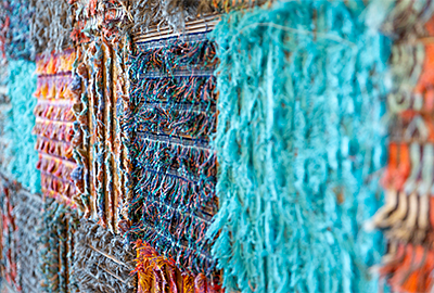
Blues—like those of the sky and sea—are calming forces in a room, but saturated shades like Classic Blue can be perceived as bold. Double down on the eye-catching factor by combining saturation with pattern, as in fabrics like Authentic Indigo and Resonate Atlantis. Both are graphic and can be used to tie together varying shades of blue in a room. Whether through drapery panels and pillows or an upholstered accent piece of furniture, jolts of deep blues can add visual interest without a firm commitment to the scheme. For a totally unexpected use, have a runner or tablecloth made for a dining room or breakfast nook from a fun blue-based print. If you tire of the pattern, you can simply switch it out without having to redo the entire room. Patterns, like color, also help set the tone of a room, and blue-based patterns can convey depth—and whimsy.

Strong, bold blues can be used as accent colors in traditional, transitional and modern interior schemes as pillows, draperies, upholstered furniture and more.
Create a Dramatic Focal Point
Go big, go bold, go blue with wallcoverings for an eye-catching room. In a traditional setting, blue walls are a springboard for a classic blue-and-white scheme. An indoor fabric like Cast Royal can help achieve drama with dimension, as well as add texture. Don’t forget some of the most dramatic places to add color are also the most unexpected: the ceiling and trim. Up the ante by using a lacquered paint finish for shine, saturation and a head-turning focal point.

Fabrics in colors inspired by Pantone’s Classic Blue help ground a room and add dimension at the same time.
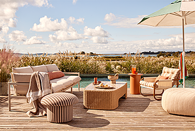
Bring In Outdoor Color
Incorporating color from nature is a goal for many homeowners who enjoy the benefits of outdoor living much of the year. Bring it to life by using blue-toned fabrics like Canvas Pacific Blue on pillows and curtains to show continuity in the space and have the eye wander back and forth. Blue also helps bring in the green from the outdoors—and the blue of the sky. Blue is a natural complement to green; they reside next to each other on the color wheel and in nature. For maximum zen, incorporate orange or red tones (i.e. wood), which lie across the color wheel from blue and green.

Shades of blue can be used both indoors and outdoors to help convey indoor/outdoor living spaces as seamless.
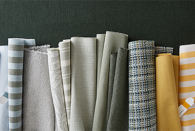
Rely on Tints, Shades and Complements

Shades, tints and complementary colors all help blue shine.
While a deep, neutral blue is top of mind right now, don’t skip on checking out its sister colors. Shades occur when black is added to a color and tints occur when white is added; both are extremely visually pleasing when combined with Classic Blue-inspired blues. Blues also occur on a spectrum of the color wheel, with some colors leaning more towards blue’s neighbor pink, and others in the other direction towards green. Any hues pulled from this family will go well together, as
nature has already proven. While blue is a great starting point, do what works best for your personality and room to achieve a beautiful space. By using any kind of blue—factually proven to be the most popular color in the world—you’ve already won. Blue won’t let you down, in 2020 or otherwise.
How have you brought Classic Blue into your home? Show your #SunbrellaMoment with us on social and share your own design!